Case Study


Expedia TAAP Trips
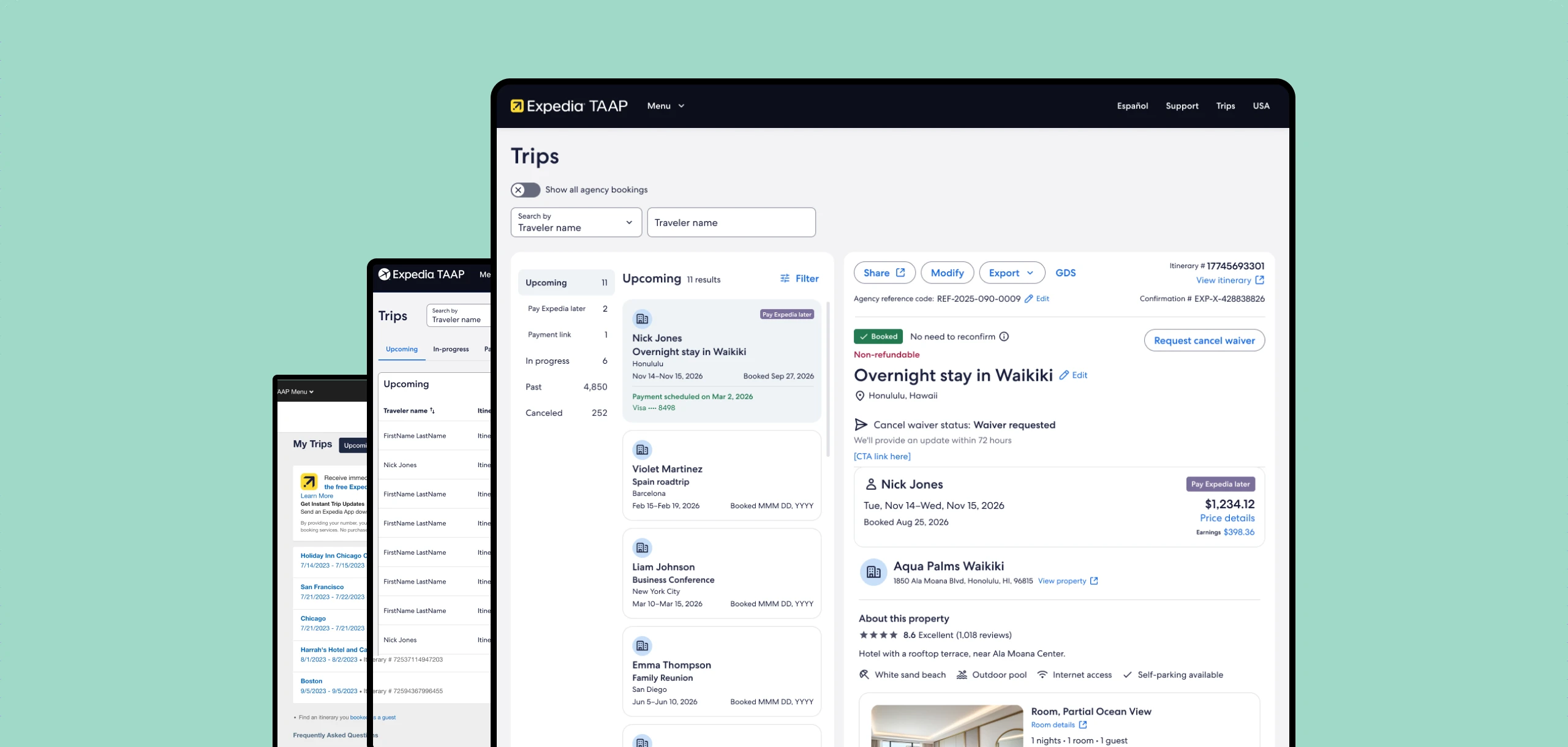
From chaos to clarity: three generations that turned a consumer list into a professional agent workspace
- Client
- Expedia TAAP
- Role
- Lead product designer
- Duration
- 2023-2026
- Tools
- Figma · Miro · Zoom

Context
What is Expedia TAAP?
Expedia TAAP is a free platform by Expedia Group that offers travel advisors access to over 900,000 properties, flights, activities, and car rentals. Agents book for clients and earn commissions on each booking, with real-time availability and dedicated support.
Trips on TAAP
The TAAP Trips page started as a consumer-borrowed flat list, with no search, no agent-specific data, and no professional tooling. Over three years, I led three successive design generations that transformed it into a research-informed professional workspace. Each version shipped to production and informed the next through user testing, and direct collaboration with the Development team.
History
The challenge
The original "My Trips" page was built for consumers, not professional travel agents. For agents managing hundreds of client bookings at once, it was completely inadequate.
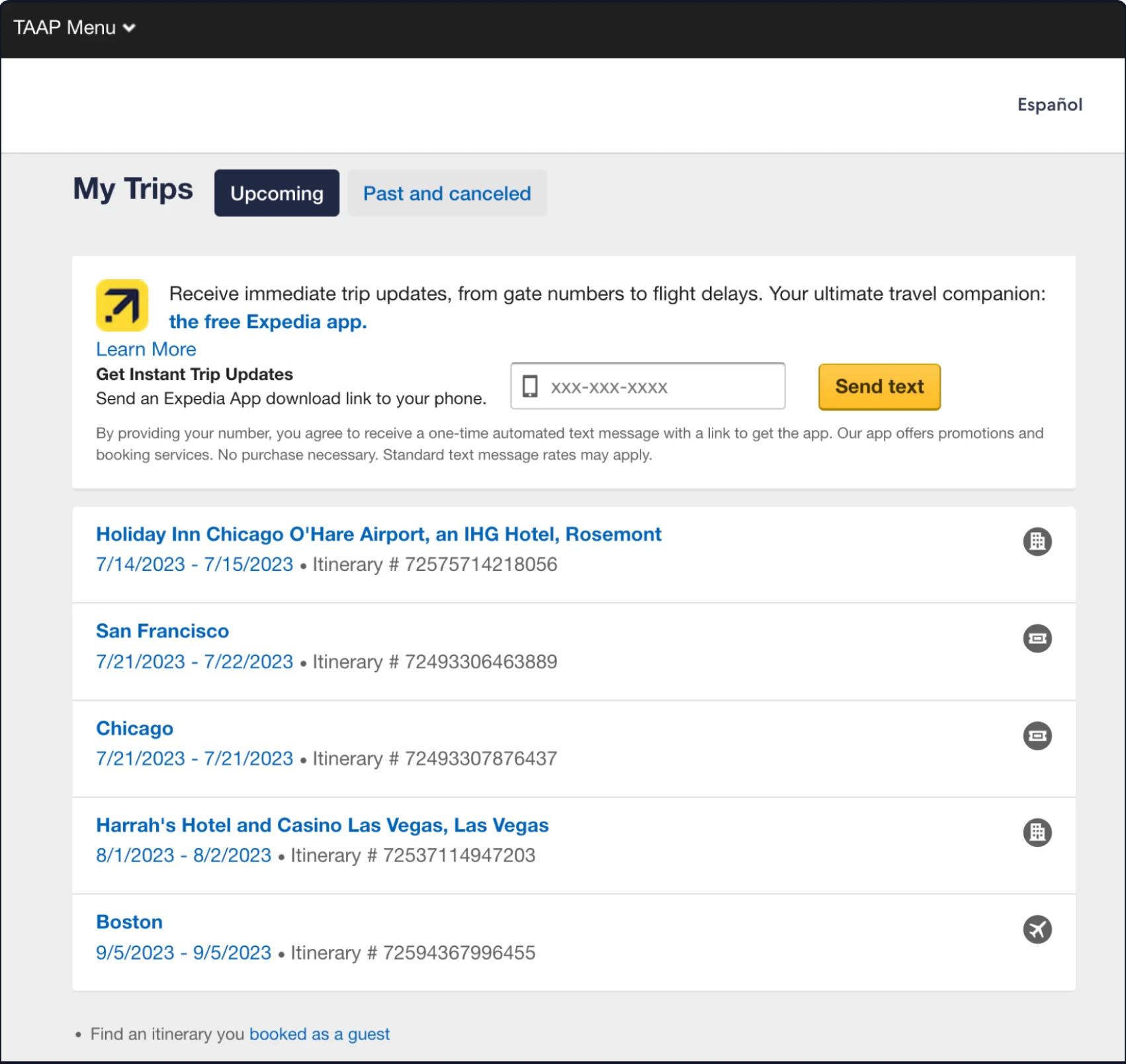
Two tabs only: Upcoming and Past and Canceled
A flat list of hyperlinks showing destination, date, and itinerary number only
No traveler name visible, which is critical for multi-client agents
No search, no filter, no booking type indicators
No earnings, no refund status, no agent-specific actions
Generation 1
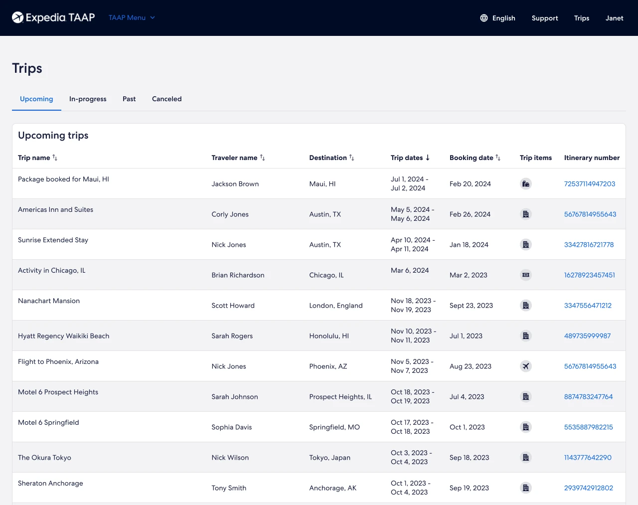
Table format redesign
Replaced the consumer pattern with a professional data table. Renamed "My Trips" to "Trips," reframing the page as an agent workspace. Designed 4 status tabs, sortable columns, LOB icons, paginated results, and universal search with typeahead and full search states.
Generation 2
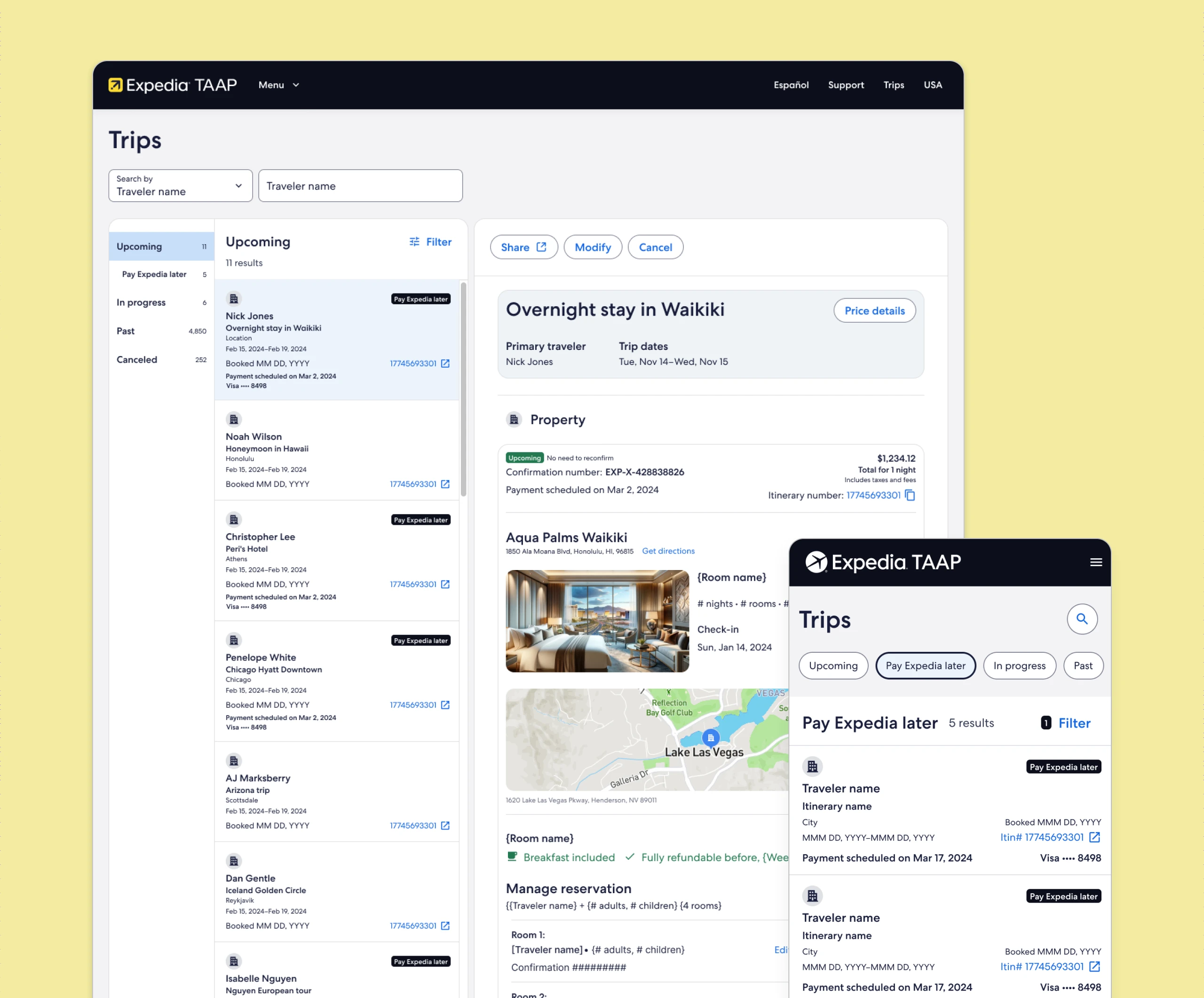
3-panel design
Post-launch research and a product direction change drove a full redesign. Before designing, I mapped the live experience as a detailed user flow, annotating every friction point. The new 3-column Outlook-style layout gave agents a persistent list on the left, contextual actions in the center, and itinerary preview on the right.
Build
Dev handoff
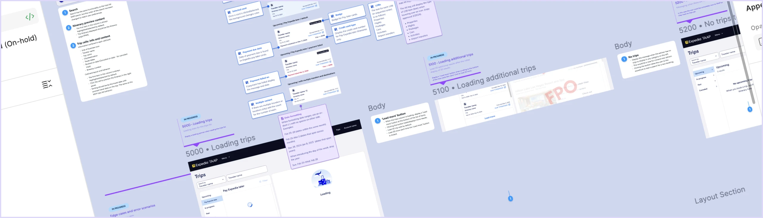
A structured dev handoff, with annotated specs, tokenized styles, and component-level documentation, bridged design and engineering so spacing, states, edge cases, and interactions shipped exactly as intended.
Generation 3
Post-launch
2025–2026
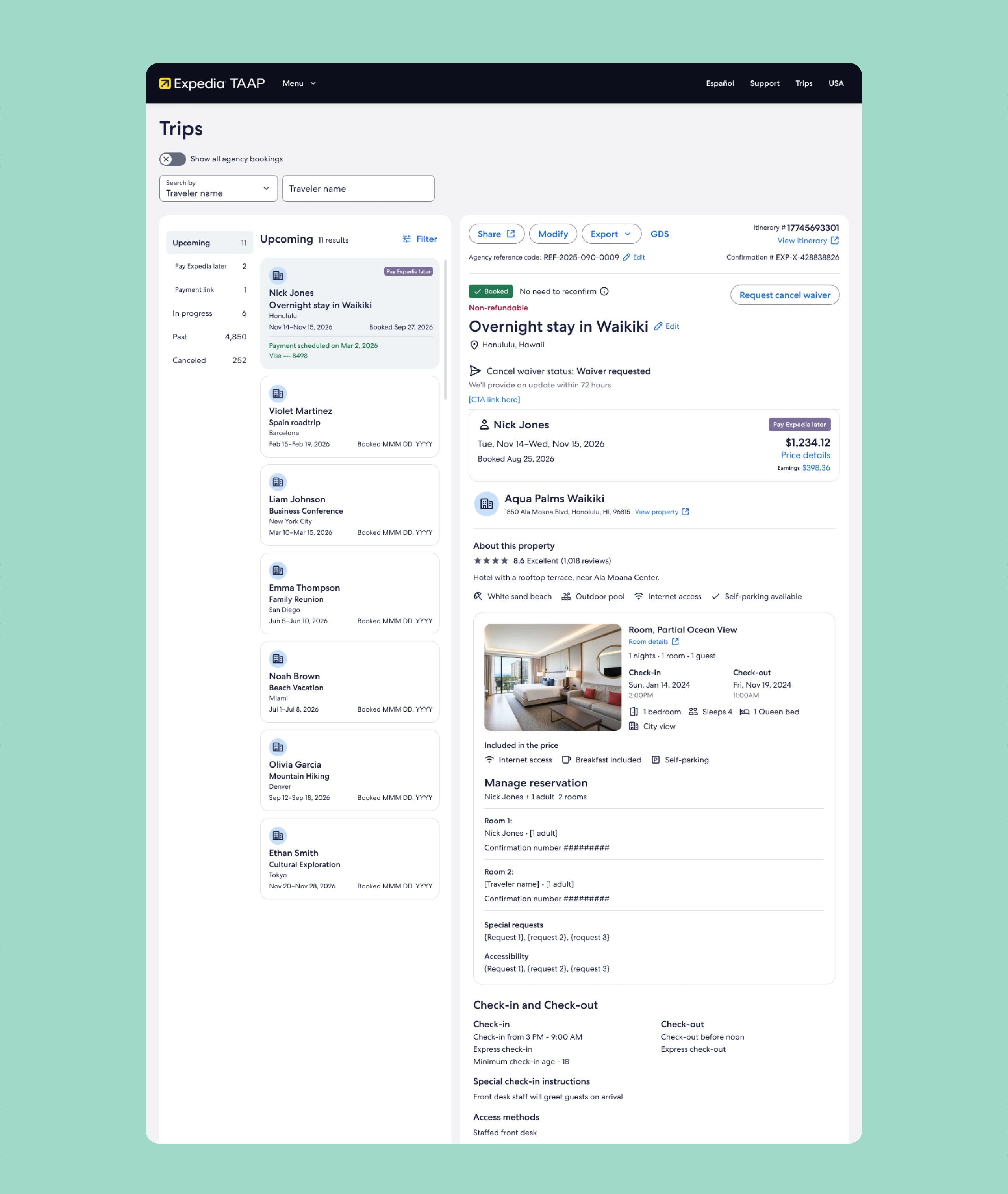
Further post-launch research, including user testing, surveys, and feedback questionnaires conducted with the Research team, surfaced specific refinements. I organized 20+ changes into four categories for engineering prioritization.
Retrospective
Results
Three design generations spanning three years, each grounded in research and each replacing the last. The original consumer UI became a professional, accessible, research-informed agent workspace.
Gen 1 shipped, establishing a B2B data table foundation with search, filtering, and LOB icons
Gen 2 shipped: a 3-column panel view replaced Gen 1 based on research and product direction
Map removal was validated independently across two separate research studies, informing a platform-wide content decision
Accessibility annotations delivered at every dev handoff across all three generations
Gen 3 enhancements in progress, with post-launch metrics to follow
Case studies
More work
 Expedia TAAP Itinerary BuilderA new tool that turns scattered bookings into one itinerary agents can share
 REACH.ai Booking DashboardBringing an outdated experience back to life again
 REACH.ai booking experienceFilling last-minute appointments to capture lost revenue for service providers, built from the ground up
 Other Expedia workMore of the work I've done at Expedia Group.
 Visual designA selection of websites and interfaces I've designed.