Case Study


REACH.ai
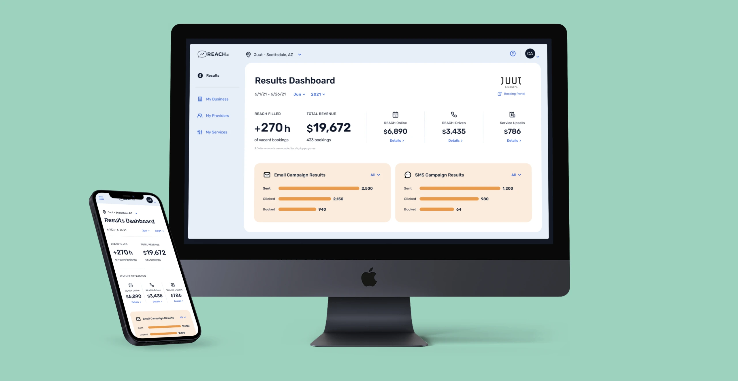
Booking Dashboard
Bringing an outdated experience back to life again
- Client
- REACH.ai
- Role
- Lead product designer
- Duration
- 2020-2022
- Tools
- Figma · Principle
Introduction
Setting the stage
Context
What is REACH.ai?
REACH integrates with your scheduling software (think hair salon) & scans your live appointment book to look for last-minute openings and cancellations. REACH then contacts your customers on your behalf to fill these appointments using machine learning algorithms to predict who most likely will fill this opening.
Merchant dashboard
Owners needed a command center that made demand, staffing, and client conversations obvious at a glance. Our task was to redesign the merchant experience so busy operators could trust the product in the middle of a packed Saturday.
PROCCESS
The plan
We framed the work as a discovery-led redesign with a clear decision path: learn fast, pressure-test assumptions, then ship in focused sprints.
Identify and understand merchant’s pain points, wants, and needs
Interview with merchants to learn about their current experience and what they expect from the experience
Evaluate the existing page designs
Conduct a 3-day in-person workshop
Wireframe concepts
Update visual designs and create a style guide/design system
Identify
Meet Emily

“I need an easy-to-use interface to gain quick, high-level insights into our client’s booking habits and how it affects our stylist’s schedule.”
Frustrations
- Managing multiple, complex communication tools
- Dashboard feels noisy during peak hours
- Appointment details exist in several separate systems
Goals
- Ability to bubble up information to business owner when asked
- Manage less inbound calls and emails regarding bookings
- Reduce front-desk interruptions
Discovery
Interviews
Because we couldn’t afford to do user testing or interviews, we offered the customer success team a list of questions to ask consumers during sales and support calls.
52
Participants
3
Questions
What we asked
- How do you feel about the design?
- How would you improve the design?
- What features are most important to you, visited most?
What we heard
“There is a lot of information on the dashboard.”
“I can’t find what I’m looking for.”
“My staff shouldn’t need a tutorial to check in a walk-up.”
“It’s difficult to change locations.”
Evaluate
Heuristic evaluation
I reviewed the existing designs and identified areas of improvement of the UI/visual design and documented experience risks.
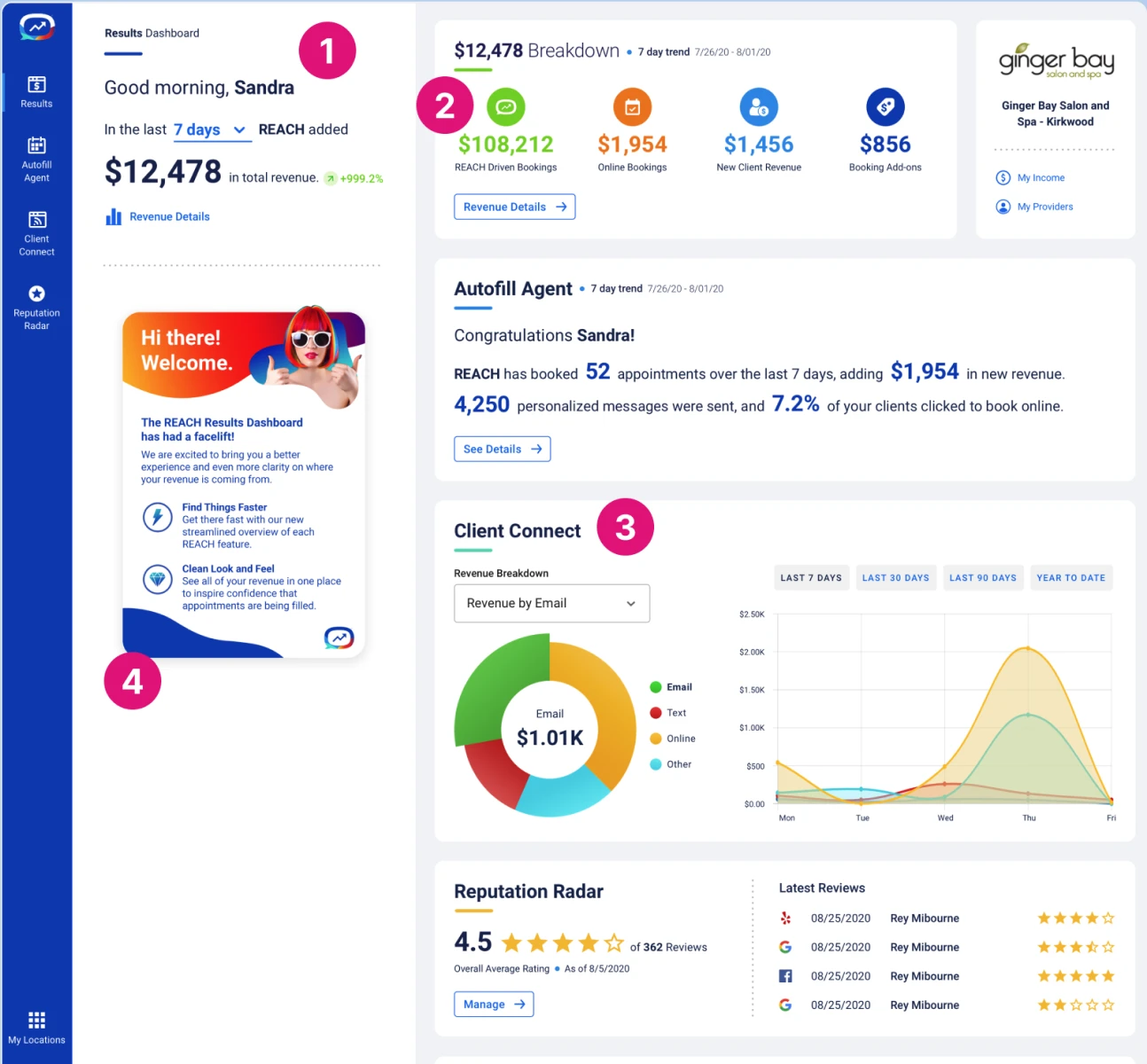
Simplify the color palette
Collapse redundant navigation into a calm primary rail
Optimize for mobile. Responsive design
Remove unnecessary/legacy features
Reduce the amount of content on the page
Establish consistent status color, type, and confirmation patterns
Discovery
Sprint
3-day, in-person workshop
I planned and lead a 3-day workshop onsite in Phoenix, Arizona. We reviewed the existing experience and eventually identified areas where we could improve the user experience.

Design sprint activities
- Stakeholder alignment
- Research synthesis
- Dot voting
- Sketching
- Crazy-eights
- Homework
- Critique
- Wireframes
- Retro
Discovery
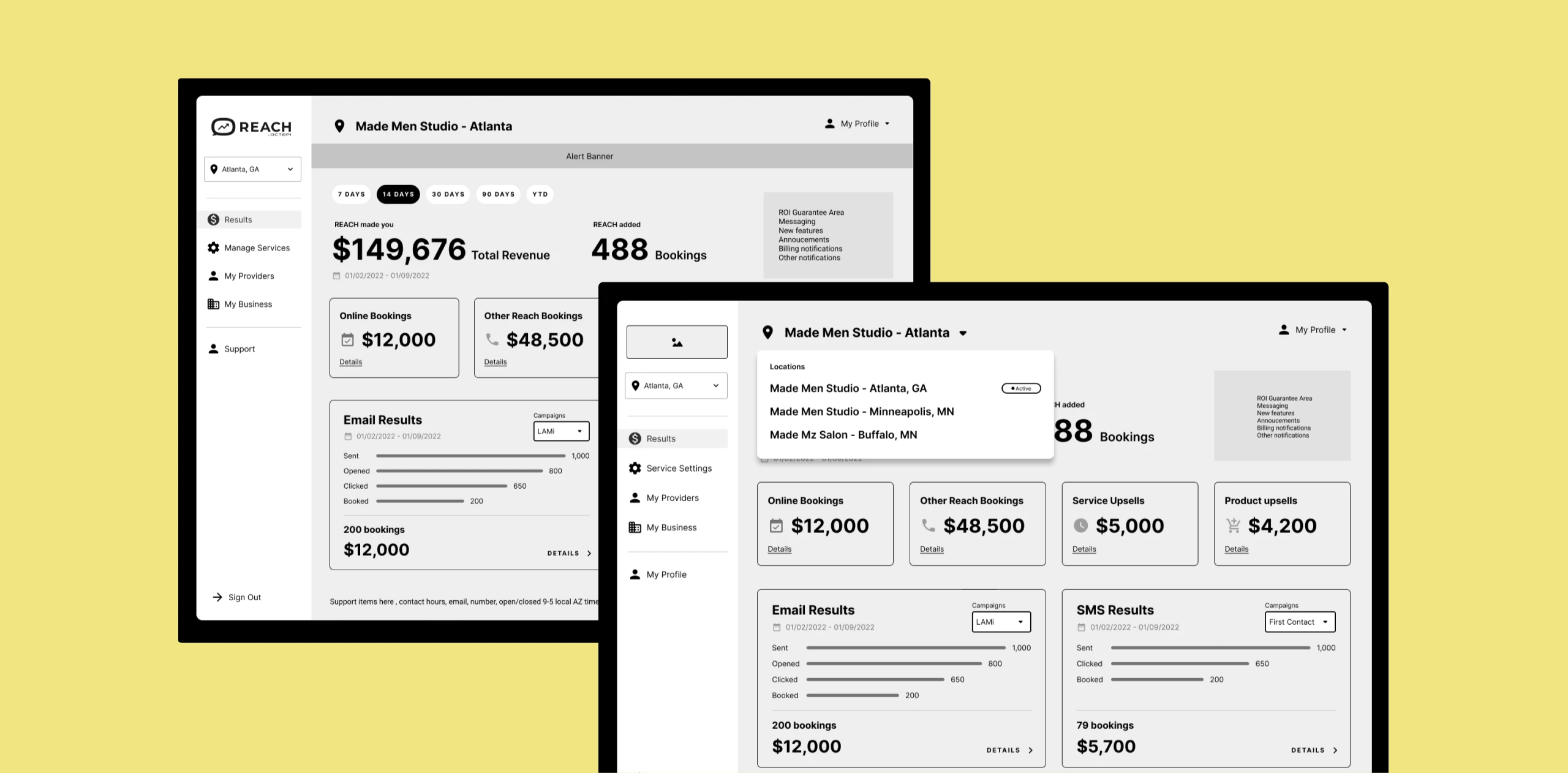
Wireframes
Structure before polish
Create
Design
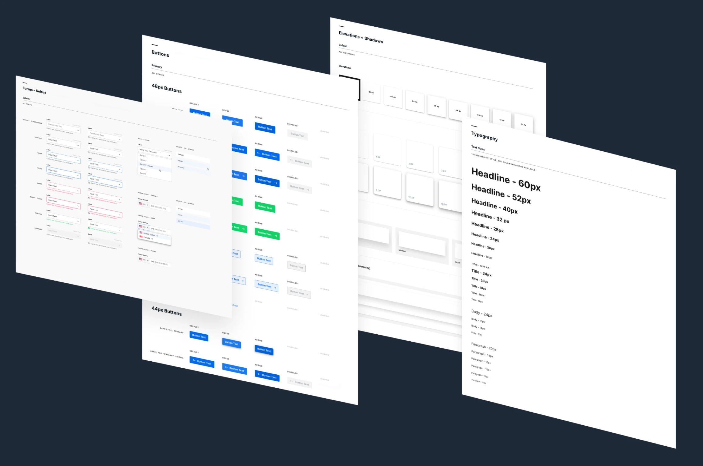
Polishing the pixels
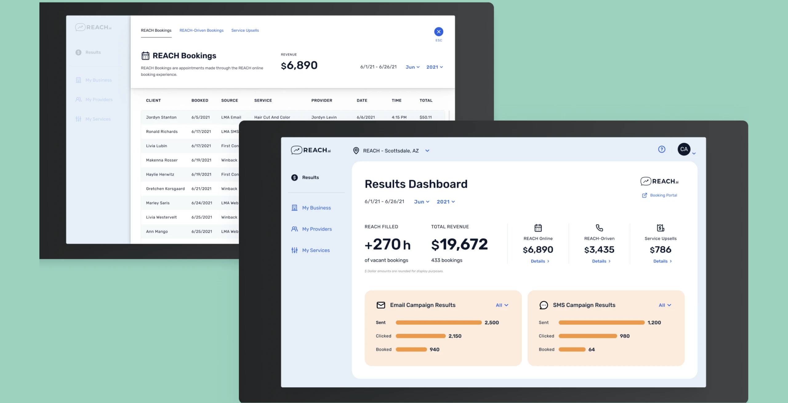
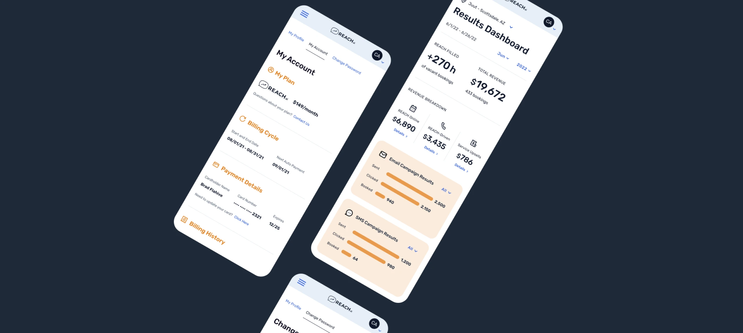
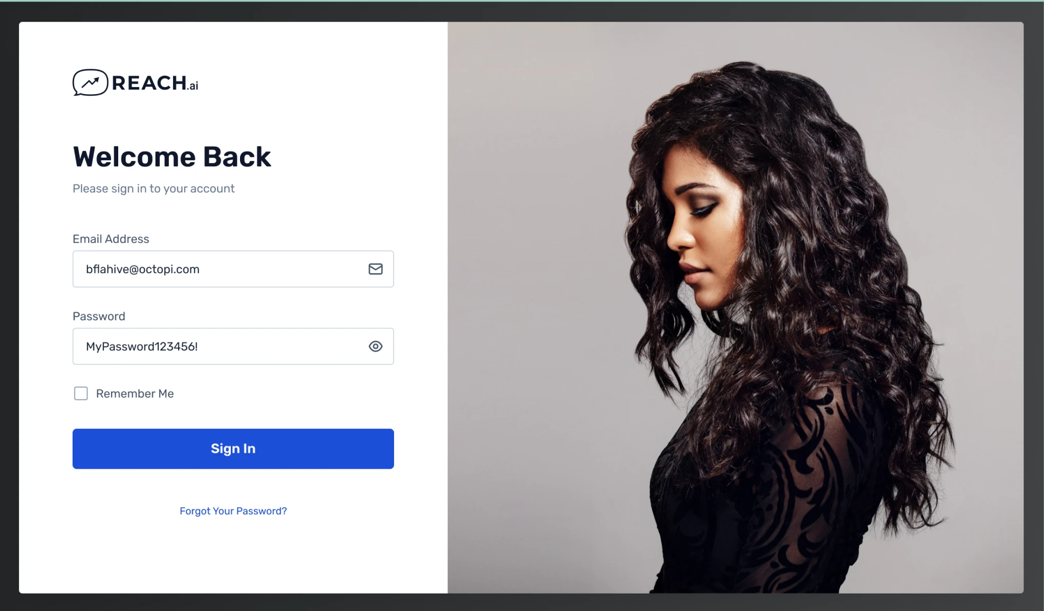
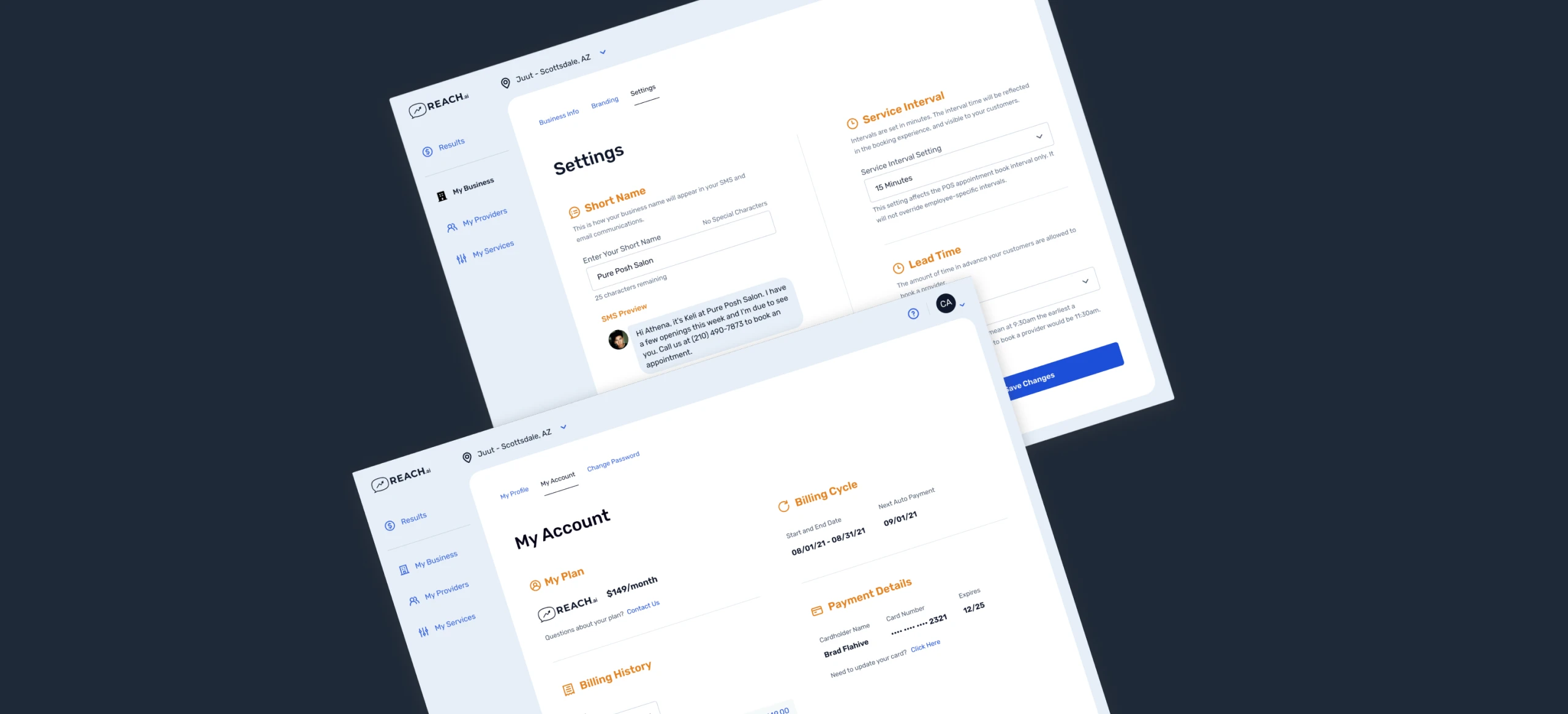
High-fidelity UI brought breathing room, confident typography, and a design system that made charts, status, and AI moments feel like one product family.
Design
Results
Project success metrics.
High-fidelity UI brought breathing room, confident typography, and a design system that made charts, status, and AI moments feel like one product family.
2x
Engagement Surge
In comparison to the previous iteration, customers spent twice as much time interacting with the dashboard over the course of a week.
-40%
Support Decline
Fewer “where do I…?” tickets as hierarchy, labels, and empty states did the teaching.
Other insights
- Positive feedback from current customer base as well as potential customers during sales demos.
- The majority of clients who were using the previous UI decided to upgrade to the new dashboard design.
Case studies
More work
 Expedia TAAP TripsFrom chaos to clarity: three generations that turned a consumer list into a professional agent workspace
 Expedia TAAP Itinerary BuilderA new tool that turns scattered bookings into one itinerary agents can share
 REACH.ai booking experienceFilling last-minute appointments to capture lost revenue for service providers, built from the ground up
 Other Expedia workMore of the work I've done at Expedia Group.
 Visual designA selection of websites and interfaces I've designed.