Case Study


TAAP Itinerary builder
From a confusing experience, to a professional-grade agent tool
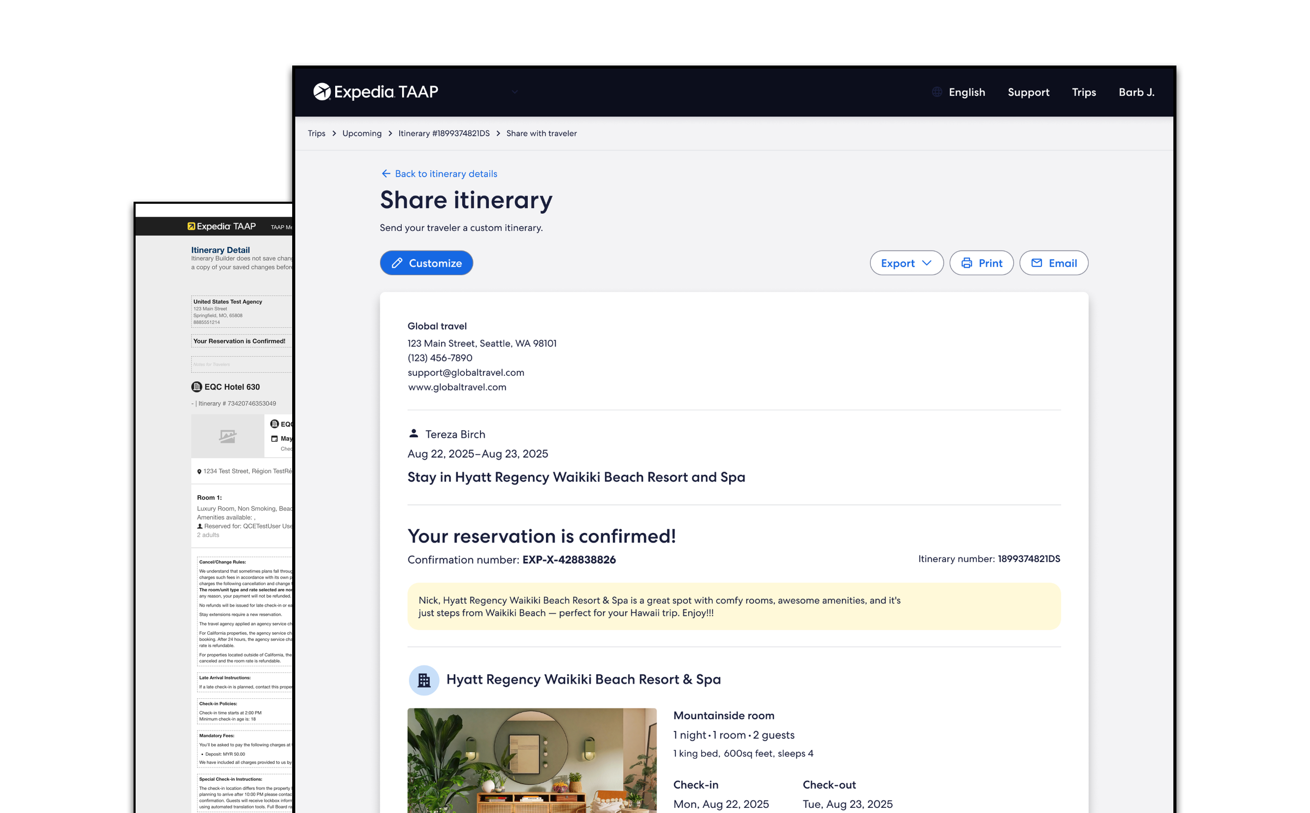
- Client
- Expedia TAAP
- Role
- Lead product designer
- Duration
- 2025-2026
- Tools
- Figma Make · Miro · UserTesting

Context
What is Expedia TAAP?
Expedia TAAP is a free platform by Expedia Group that offers travel advisors access to over 900,000 properties, flights, activities, and car rentals. Agents book for clients and earn commissions on each booking, with real-time availability and dedicated support.
Itinerary builder
TAAP agents had powerful booking tools but no way to curate or share what they’d booked with their travelers. I led end-to-end design of a new itinerary builder, from discovery through a 2-day design sprint, AI-assisted prototyping with Figma Make, and moderated research with 6 travel agents, to a fully accessible dev handoff across both desktop and mobile platforms.
History
The challenge
Travel agents using TAAP could book flights, hotels, and experiences, but once bookings were made, there was no unified view for the agent or the traveler. Agents were forced to manually compile trip details outside the platform, creating extra work and an inconsistent client experience on both desktop and mobile.
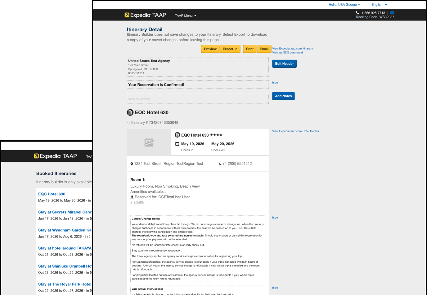
Pain points
Messy, unorganized list of itineraries
Ability to adjust content was limited
Outdated UI
Limited preview functionality
Inconsistent content hierarchy
Discovery
Foundations
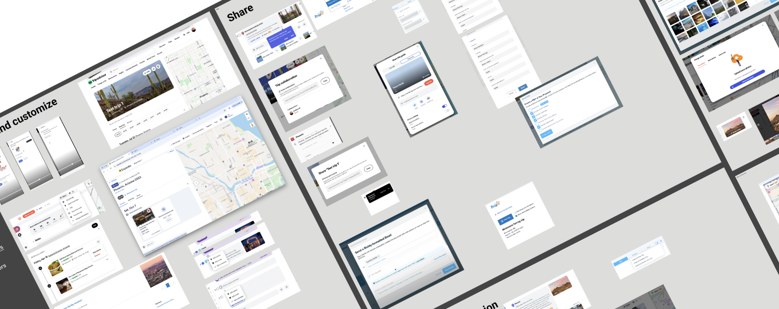
Discovery & competitive audit
Reviewed how other platforms handle itinerary sharing across desktop and mobile to identify patterns and inspiration before any design work began.
Discovery
Sprint
A 2-day design sprint exploring 3 concepts
Facilitated a sprint with UX, Research, and Content.
Sprint overview
- Day 1: reviewed current experience and presented 3 interaction concepts.
- Day 2: dot voting, discussion, and takeaways.
Activities
- Stakeholder alignment
- Research synthesis
- Dot voting
- Sketching
- Crazy-eights
- Homework
- Critique
- Wireframes
- Solution
- Retro
Discovery
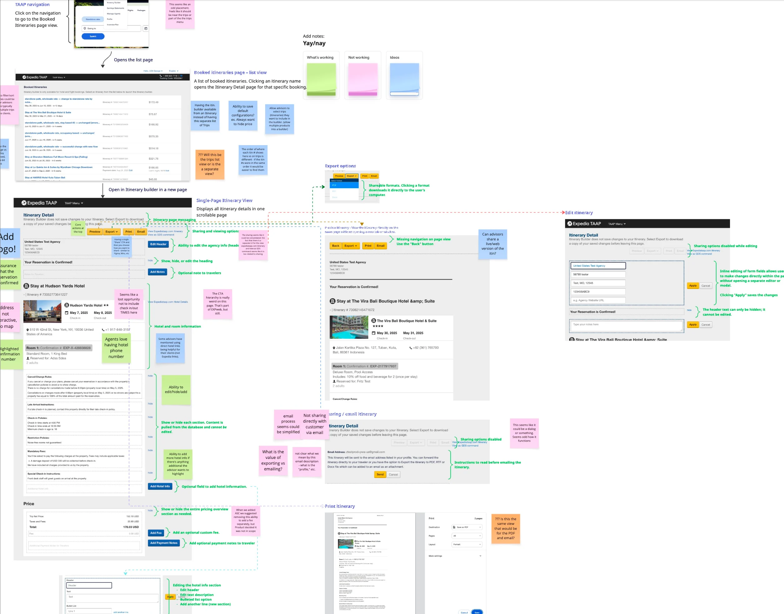
Wireframes
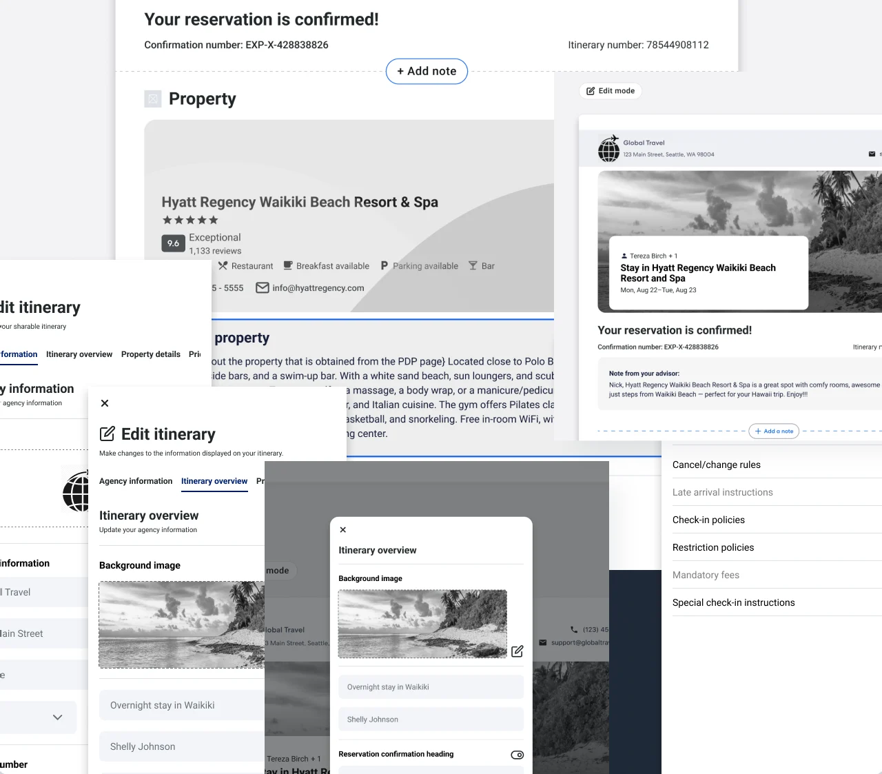
3 Concepts explored
Make
Prototype
Figma Make prototype built for research
Used Figma Make (AI-powered prototyping) to build a working, interactive prototype, giving interview participants a realistic experience rather than a standard click-through and leading to richer feedback.
Discovery
Interviews
8-task sessions over Zoom using a think-aloud protocol while the participants navigated through the Figma Make prototype. Findings directly shaped final design iterations before handoff.
6
Participants
8
Tasks
8+
Hours
Findings
- Agents found and used the primary share flow, Preview and Share with Traveler, without assistance.
- All 6 participants rated the layout clean and professional.
- Show/hide section controls stood out as highly valuable for customizing what travelers see.
- A working Figma Make prototype felt realistic to participants, which led to richer feedback than a click-through.
Make
Design
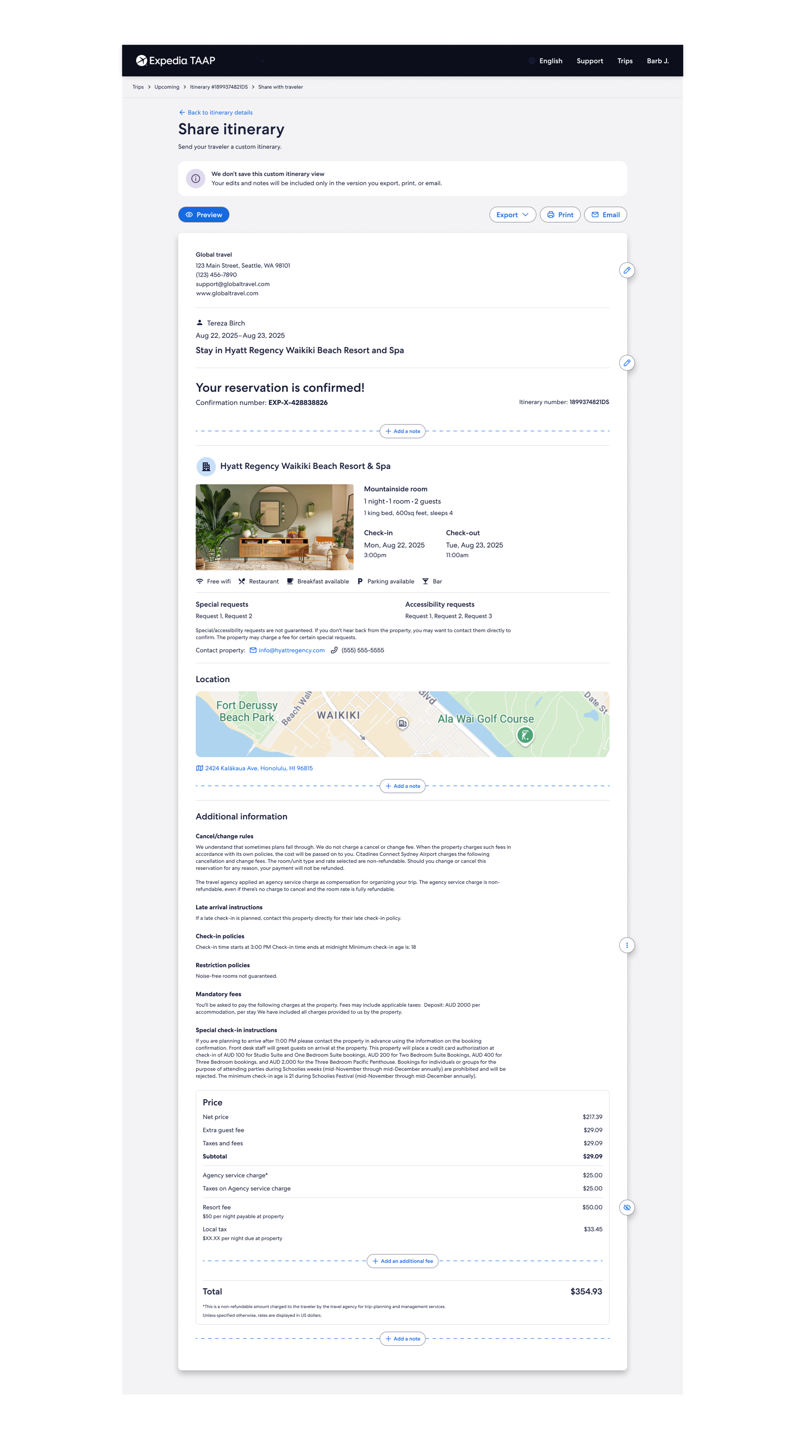
Final designs for desktop and mobile
Production-ready UI with full accessibility annotations, conditional logic, and edge case coverage delivered at dev handoff.
Retrospective
Results
The moderated research study validated the core interaction model. Agents consistently discovered and used the primary share flow without assistance. Layout was rated clean and professional. Show/hide controls were highlighted as particularly valuable. Quantitative adoption metrics to follow post-launch.
Preview and Share with Traveler consistently discovered and used correctly
Layout rated clean and professional by all 6 participants
Show/hide section controls rated highly valuable for customization
Fully accessible dev handoff delivered with WCAG annotations
Agent adoption and share-rate metrics — to follow post-launch
Case studies
More work
 Expedia TAAP TripsFrom chaos to clarity: three generations that turned a consumer list into a professional agent workspace
 REACH.ai Booking DashboardBringing an outdated experience back to life again
 REACH.ai booking experienceFilling last-minute appointments to capture lost revenue for service providers, built from the ground up
 Other Expedia workMore of the work I've done at Expedia Group.
 Visual designA selection of websites and interfaces I've designed.