Case Study


REACH.ai
booking experience
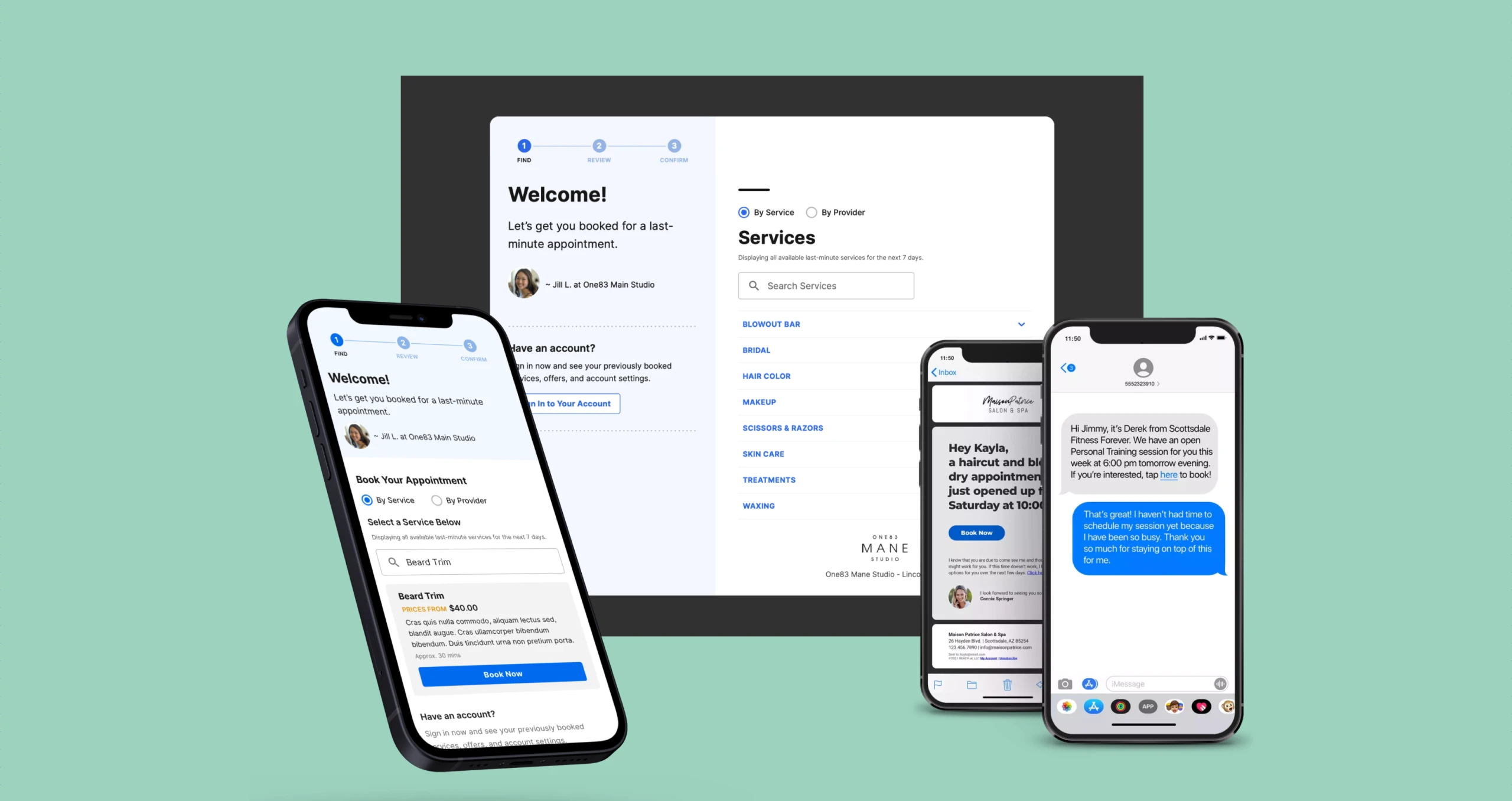
Filling last-minute appointments to capture lost revenue for service providers, built from the ground up
- Client
- REACH.ai
- Role
- Lead product designer
- Duration
- 2020-2022
- Tools
- Figma · Principle
Introduction
Setting the stage

Context
What is REACH.ai?
REACH integrates with your scheduling software (think hair salon) & scans your live appointment book to look for last-minute openings and cancellations. REACH then contacts your customers on your behalf to fill these appointments using machine learning algorithms to predict who most likely will fill this opening.
Booking experience
Once identified, users are contacted to complete appointments via the Booking Experience. They can log in using methods like email or SMS, depending on their status. The goal is to manage all situations while ensuring a simple, enjoyable experience, improving bookings and reducing drop-off.
PROCCESS
The plan
We needed to build merchant’s customers a brand new experience for booking with providers offering last-minute appointments.
We framed the work as a discovery-led redesign with a clear decision path: learn fast, pressure-test assumptions, then ship in focused sprints.
Understand our users
Create a clear information architecture
Gather inspiration
Optimize the user experience and design a new UI
Create an atomic design system
Identify
Our audience
High-fidelity UI brought breathing room, confident typography, and a design system that made charts, status, and AI moments feel like one product family.

Frustrations
- Booking appointments far into the future
- I don’t want to think about booking
- Being placed with a different provider (no rapport)
Goals
- Easy booking
- Book on a cadence
- No hassle
Discovery
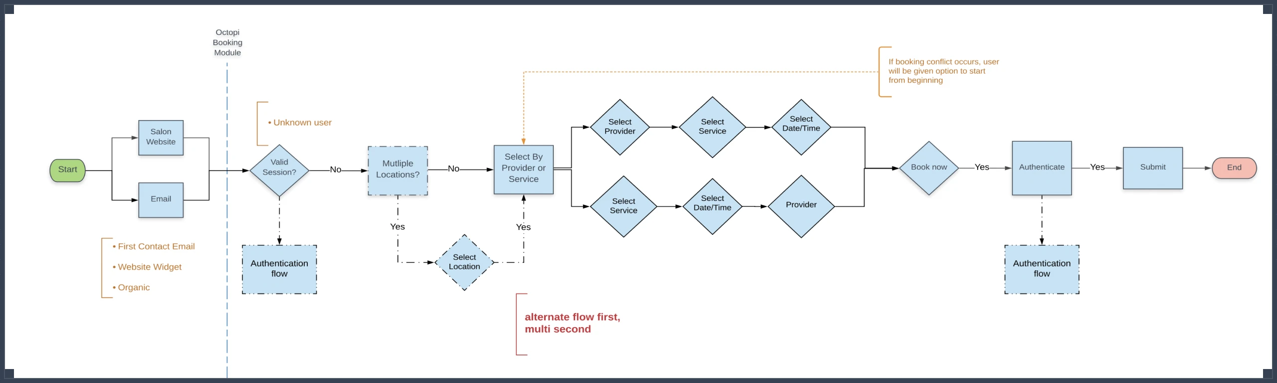
Information architecture
Mapping out the experience
Sitemaps, content hierarchies, and navigation models were developed to organize information intuitively, ensuring users could find what they needed without friction across every touchpoint.
Research
Competitive analysis
I explored existing booking flows and studied UX/UI patterns for last-minute reservations to inform the experience I was designing.
Design
Design & handoff
Polishing the pixels
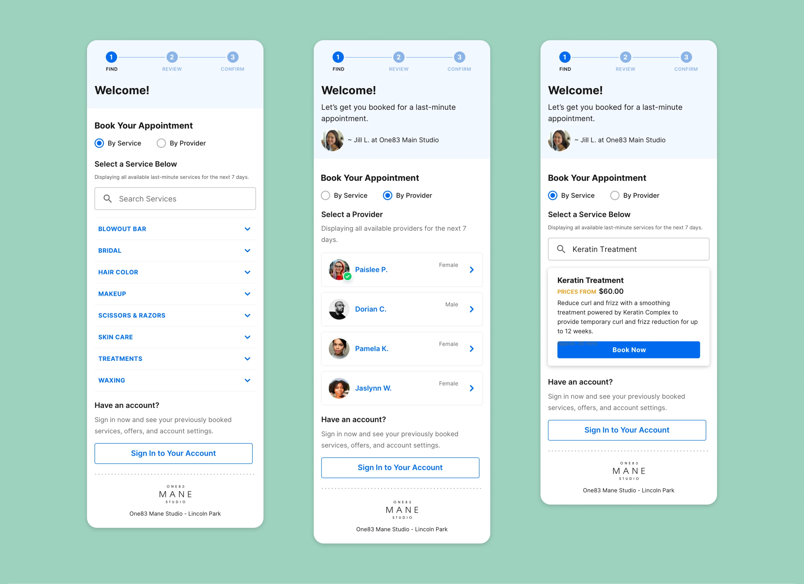
Welcome screen
We designed a welcome screen for users to search by service or provider. A search function helps find services easily.
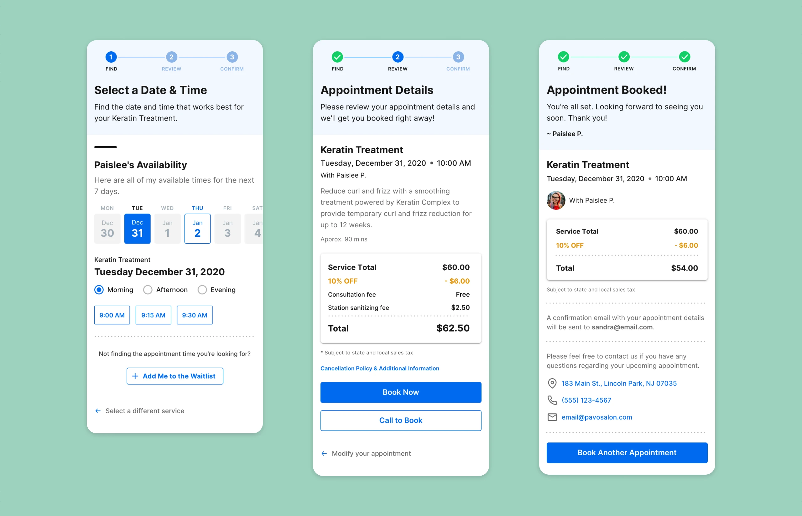
Book an appointment
A simple and quick 3-step process was implemented into the design to give the users a pleasant experience booking a last-minute appointment
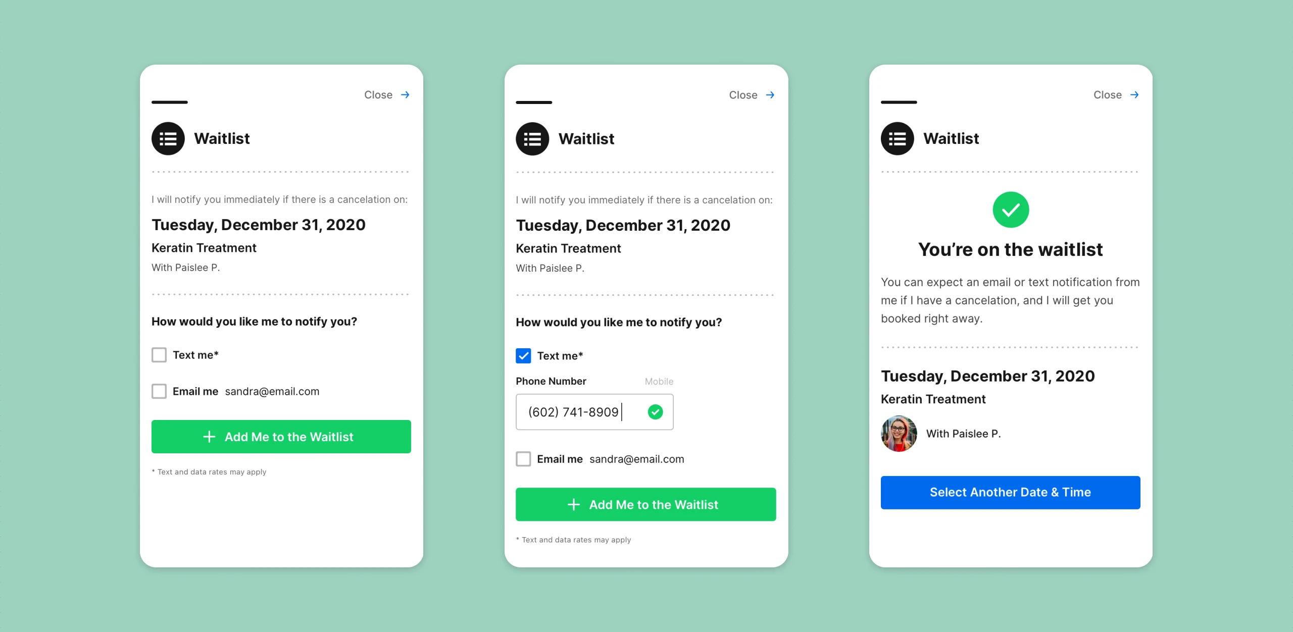
Join a waitlist
Users wanted to see a provider at a specific time, so we added a waitlist. After testing, it didn’t significantly impact bookings and was removed.
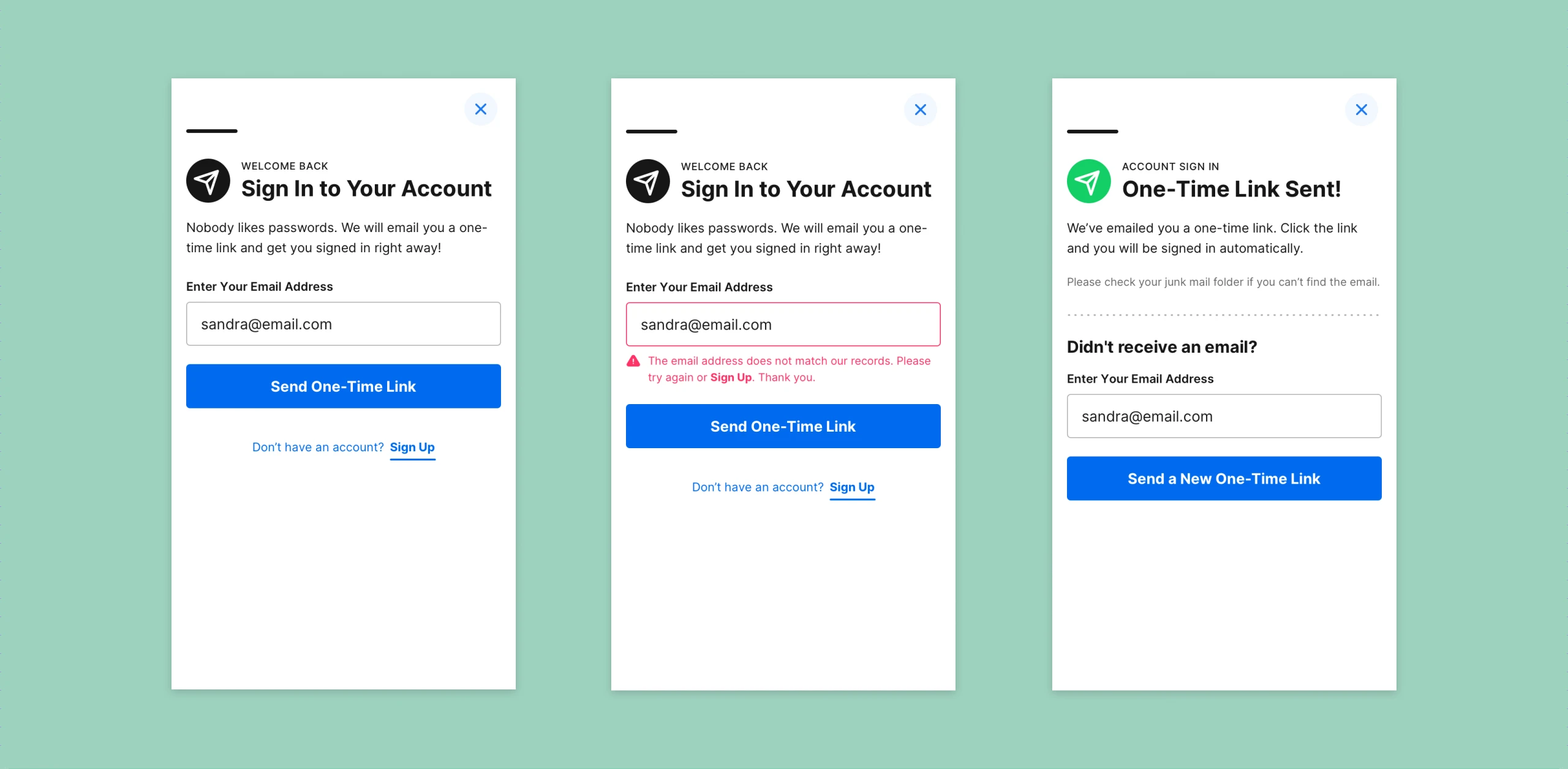
1-step SSO sign in
We simplified sign-in to a single SSO step, significantly reducing drop-off rates.
Retrospective
Results
Our new booking platform was a success, as confirmed by users. Without metrics, we relied on real-time feedback to iterate and refine the design. User testing further shaped the project.
Case studies
More work
 Expedia TAAP TripsFrom chaos to clarity: three generations that turned a consumer list into a professional agent workspace
 Expedia TAAP Itinerary BuilderA new tool that turns scattered bookings into one itinerary agents can share
 REACH.ai Booking DashboardBringing an outdated experience back to life again
 Other Expedia workMore of the work I've done at Expedia Group.
 Visual designA selection of websites and interfaces I've designed.